A brand guidelines document has one job: to let anyone apply your brand correctly without having to ask. A new hire, a freelancer, a printer, a partner or an agency should be able to open it and produce something that looks and sounds like you.
The best guidelines are short, visual and practical. The worst are hundred-page PDFs nobody opens. Here's what to include.
1. The brand in one page
Start with the why, briefly:
- What the business does and for whom
- The brand's personality in three to five words
- The core message or promise
- What makes it different
This page helps people make good decisions in situations the rules don't cover.
2. Logo
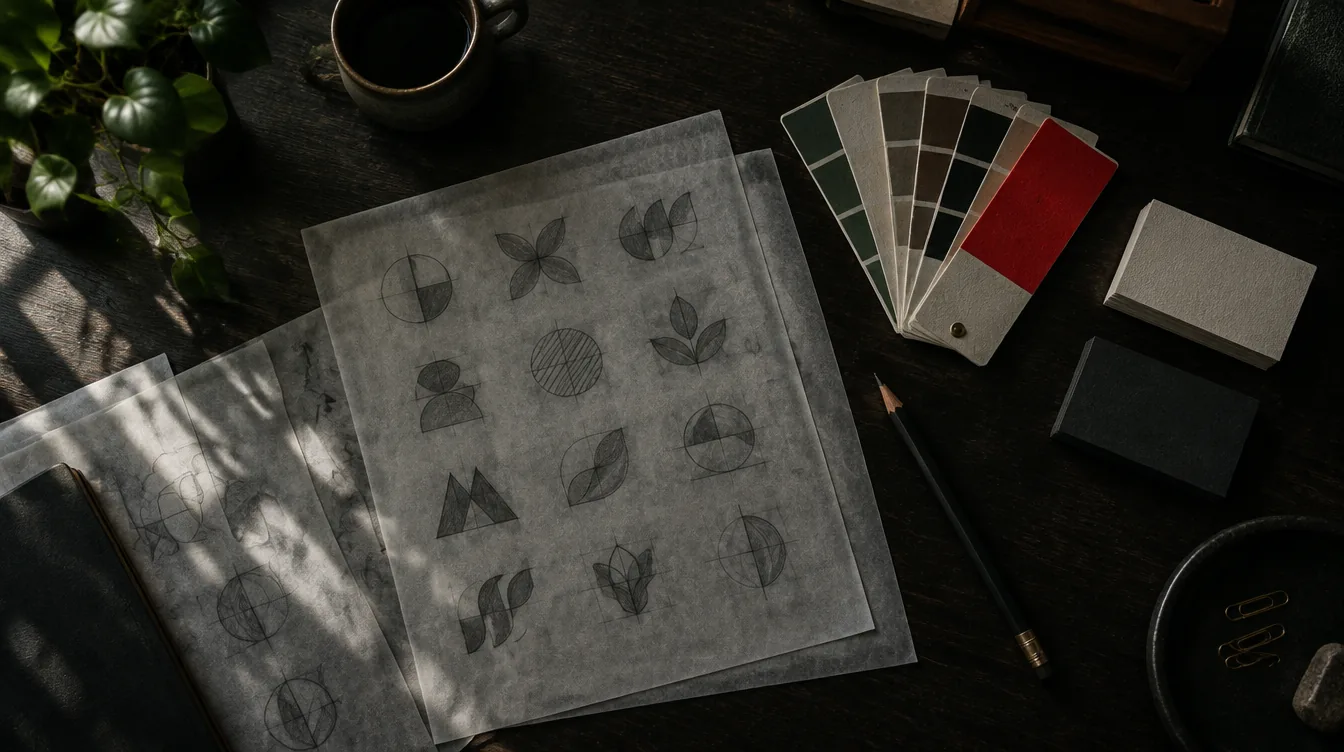
- Versions: primary, secondary (for example stacked or horizontal), icon or monogram
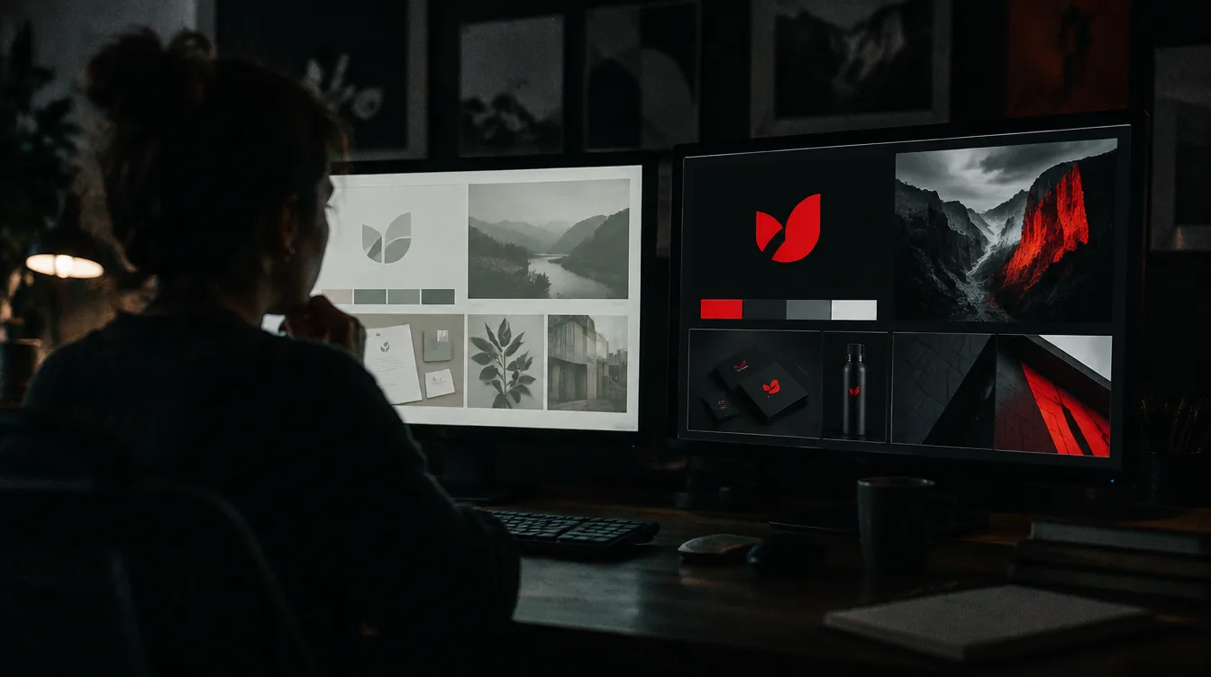
- Colour versions: full colour, one colour, white on dark, black on light
- Clear space: the minimum space around the logo
- Minimum size: for screen and print
- Placement: preferred positions on common formats
- Don'ts: stretching, recolouring, adding effects, placing on busy backgrounds, shown visually
3. Colour
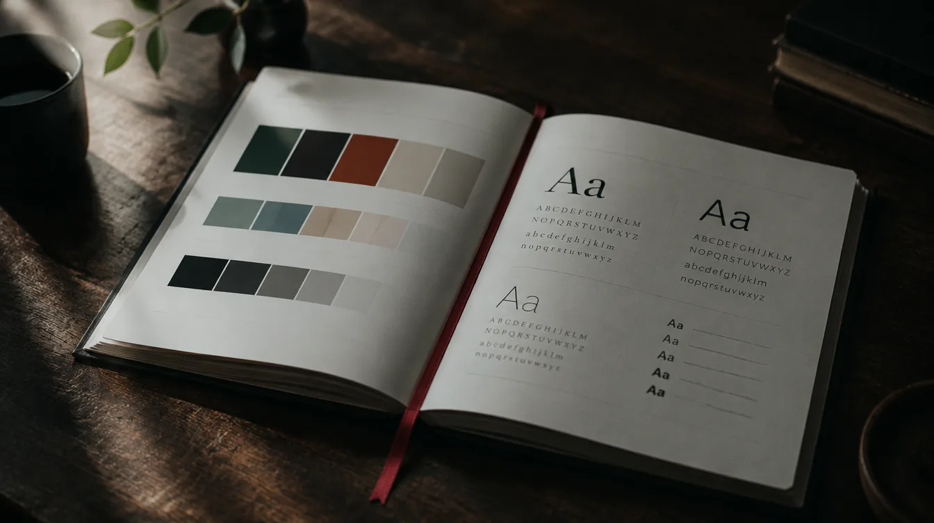
- Primary and secondary colours, with HEX, RGB, CMYK and, if you print a lot, Pantone values
- Proportions: how much of each colour to use (for example mostly neutral with a small accent)
- Accessible combinations: which text and background pairs are readable
- Any colours to avoid
4. Typography
- Headline and body typefaces, with where to get them and licence notes
- A type scale: sizes and weights for headings, subheadings, body and captions
- Line spacing and letter spacing guidance
- Fallback fonts for email, documents and systems that can't use the brand fonts
5. Imagery
- Photography style: lighting, colour, subjects, composition
- What to avoid: cheesy stock, certain angles, cluttered backgrounds
- Illustration or icon style, if you use them
- AI imagery rules, if you use it: the look, what is allowed, and the need to check details like hands, text and products
6. Graphic elements and layout
- Shapes, patterns, textures, frames or gradients that belong to the brand
- Grid and spacing principles
- Examples of good layouts for common formats
7. Tone of voice
- How the brand sounds: three or four traits with short explanations
- Do and don't examples: the same message written on-brand and off-brand
- Words and phrases you use, and ones you avoid
- Formatting preferences: sentence case or title case, spelling (British or American), how you write numbers and dates
8. Applications
Show the brand on the things people actually make:
- Social media posts and stories
- Website sections
- Presentations and proposals
- Email signatures
- Business cards and stationery
- Signage, packaging or merchandise, if relevant
9. Templates and files
This is the section that makes or breaks consistency. Include:
- Logo files in every format (SVG, PNG, PDF), named clearly
- Editable templates for social posts, presentations and documents, in the tools your team uses (Canva, Figma, Google Slides, PowerPoint)
- Font files or links
- Colour swatches
People follow templates far more reliably than rules.
10. Ownership and contact
- Who owns the brand and approves new uses
- How to request new assets
- When the guidelines were last updated
Keep it alive
Make it easy to find. A web page or a shared folder beats an attachment buried in an email.
Keep it short. Twenty clear pages beat a hundred thorough ones.
Update it. Add new templates and examples as the brand grows, and remove what's outdated.
Lead by example. If the leadership team ignores the guidelines, everyone will.
Every brand identity we create comes with guidelines, templates and files ready to use. If yours needs tidying up, book a free 30-minute call.